Constraints tell how layers/elements should respond when you resize their frames. This helps you to control how designs look across different screen sizes and devices.
There are Horizontal and vertical constraints.
Horizontal constraints define how a layer behaves, as you resize the frame along the x axis.
- Left maintains the layer’s position, relative to the left side of the frame.
- Right maintains the layer’s position, relative to the right side of the frame.
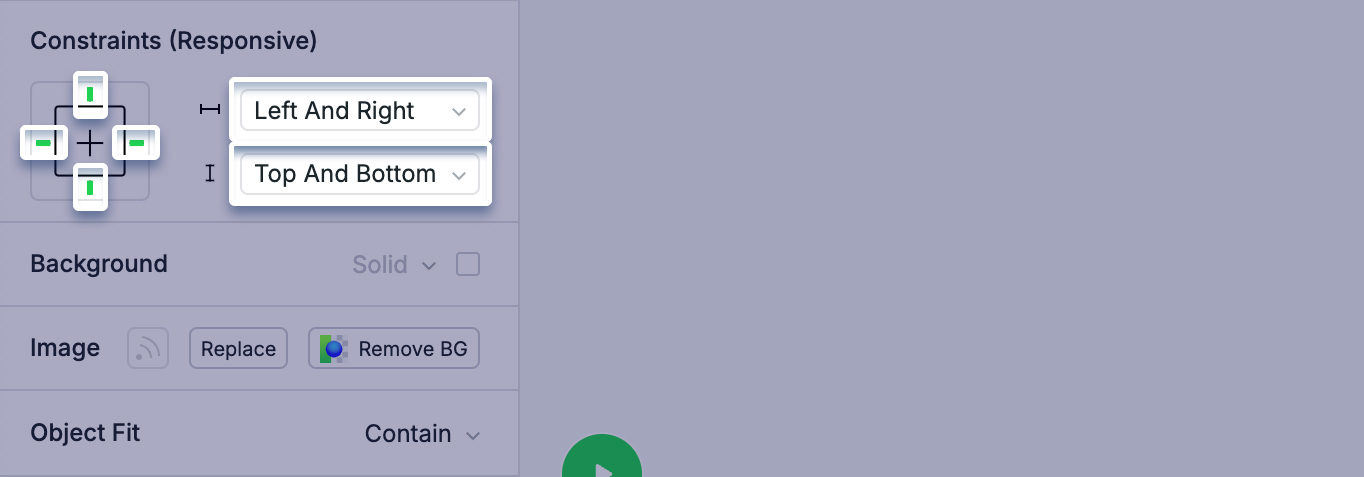
- Left and right maintains the layer’s size and position relative to both sides of the frame. This may cause layers to grow or shrink along the x axis, when resized.
- Center maintains the layer’s position, relative to the horizontal center of the frame.
- Scale will define the layer’s size and position as a percentage of the frame’s dimensions. It will then maintain those proportions as you resize it.
- Relative means that these constraints depend on the relative positioning, or comparison with other layers
Vertical constraints define how a layer behaves, as you resize the frame along the y axis.
- Top maintains the layer’s position, relative to the top of the frame.
- Bottom maintains the layer’s position, relative to the bottom of the frame.
- Top and bottom maintains the layer’s size and position relative to the top and bottom of the frame. This may cause layers to grow or shrink along the y axis, when resized.
- Center maintains the layer’s position, relative to the vertical center of the frame.
- Scale will define the layer’s size and position as a percentage of the frame’s dimensions. It will then maintain those proportions as you resize it.
- Relative means that these constraints depend on the relative positioning, or comparison with other layers
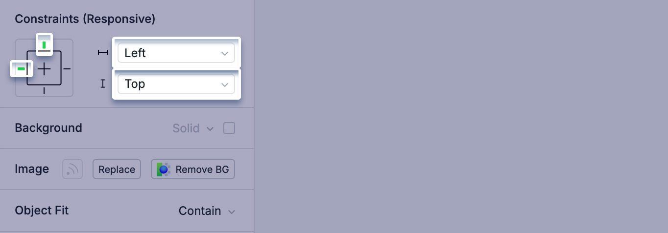
Horizontal : Left Vertical: Top
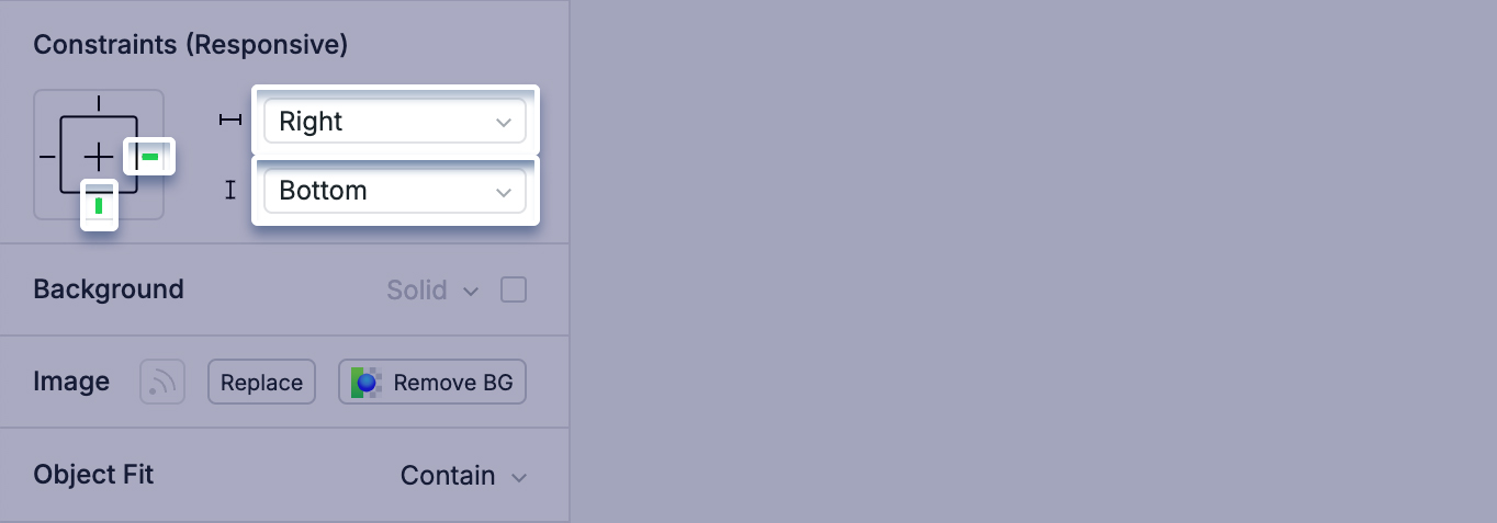
Horizontal : Right Vertical: Bottom
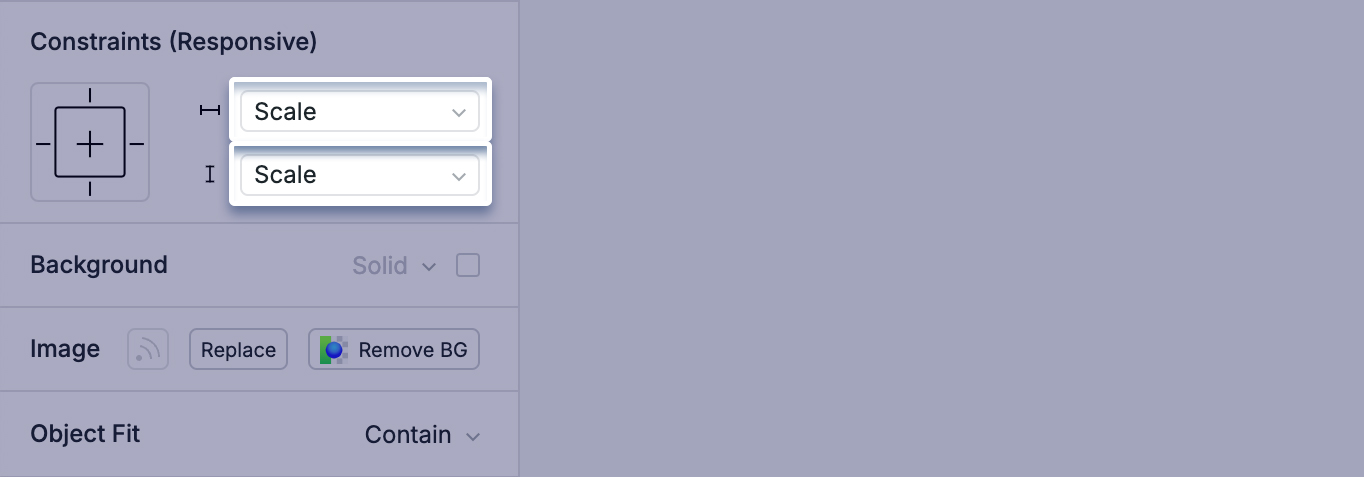
Horizontal : Scale Vertical: Scale
Horizontal : Left and Right Vertical: Top and Bottom
Let’s now explore the Relative feature, which enables you to create constraints based on relative positioning or comparisons with other layers.
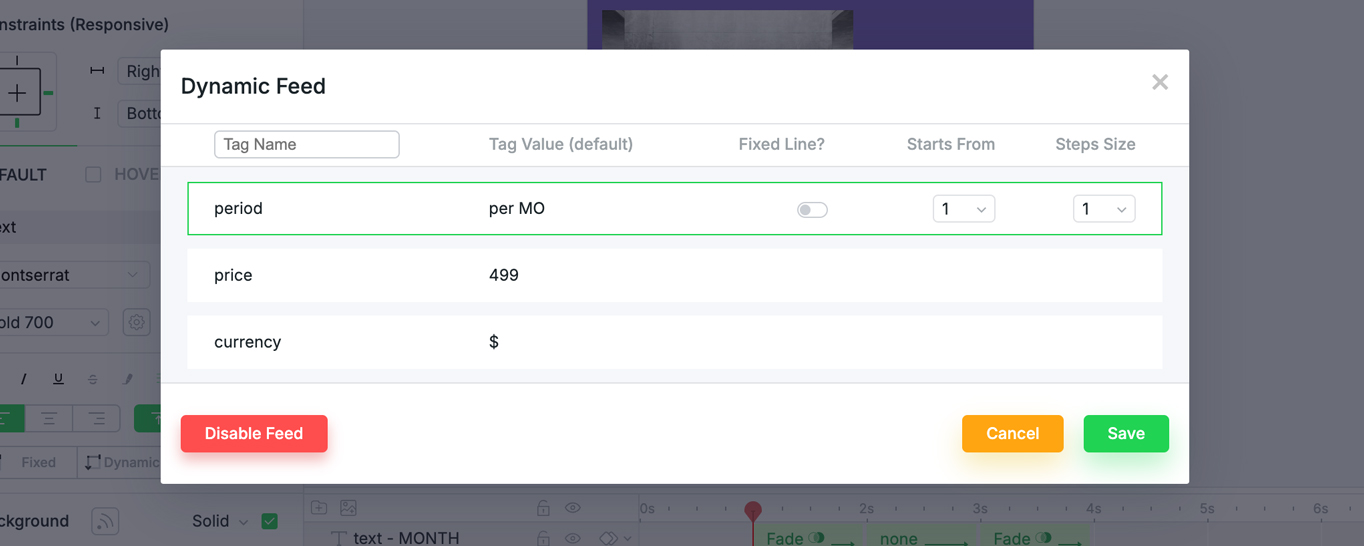
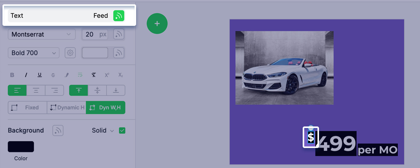
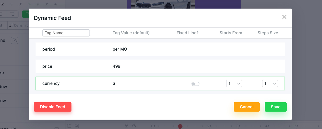
Consider a product price feed. Each price is made up of three elements: currency, product cost, and payment frequency. When this price changes, it should retain its relative structure.
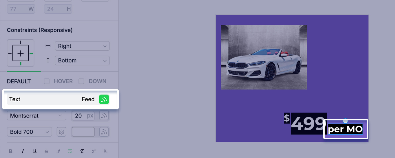
Let’s connect each element of the price to the feed.
Connect payment frequency:
Connect product cost:
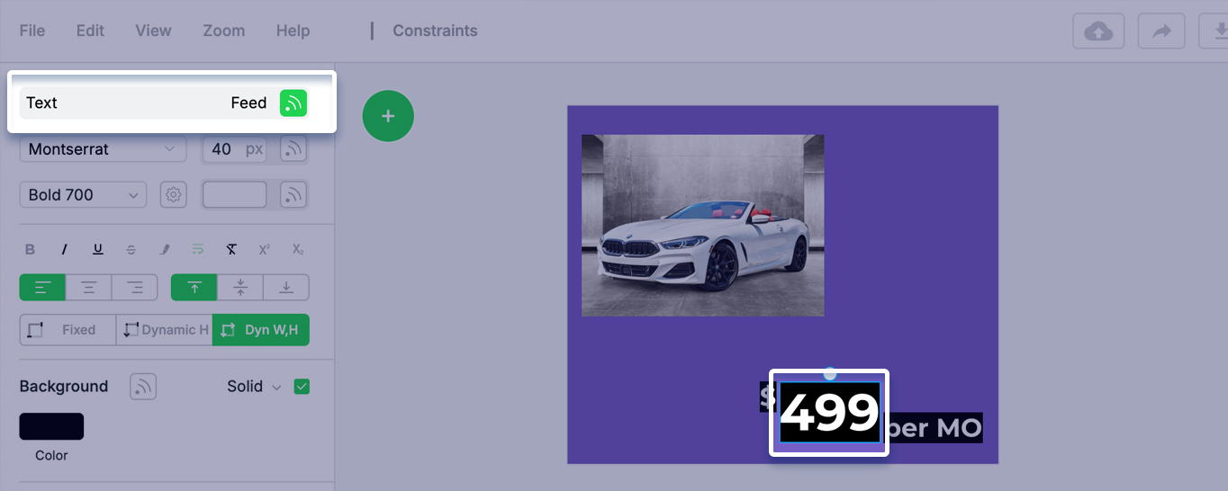
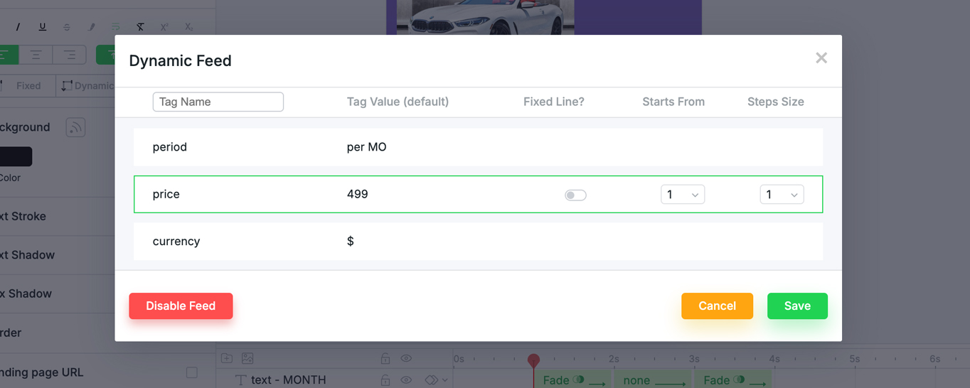
Connect currency:
Next, let’s set Constraints to each layer.
Let’s say we want the price to be always positioned to the right bottom corner of our creative.
First set the “per MO” text to the right bottom and also the text container – Dynamic Width and Height. In case it will be more text, the container will resize.
The second price element “499” should remain adjacent to the “per MO” text, maintaining a 2px distance between them.
Set Relative option for both horizontal and vertical axes.
For horizontal and vertical select the anchor points: left X position and bottom Y position relative to “per MO”.
For horizontal set offset -2px gap separating “499” element from “per MO”.
The third currency element “$” should remain adjacent to the “499” text, maintaining a 2px distance between them and aligned to top.
Set Relative option for both horizontal and vertical axes.
For horizontal and vertical select the anchor points: left X position and top Y position relative to “499”.
For horizontal set offset -2px gap separating “$” element from “499”.
Let’s see the result.
This features are very useful for creatives connected to feeds because it ensures that ads are always well-structured and prevents elements from sliding out of place or being misaligned.
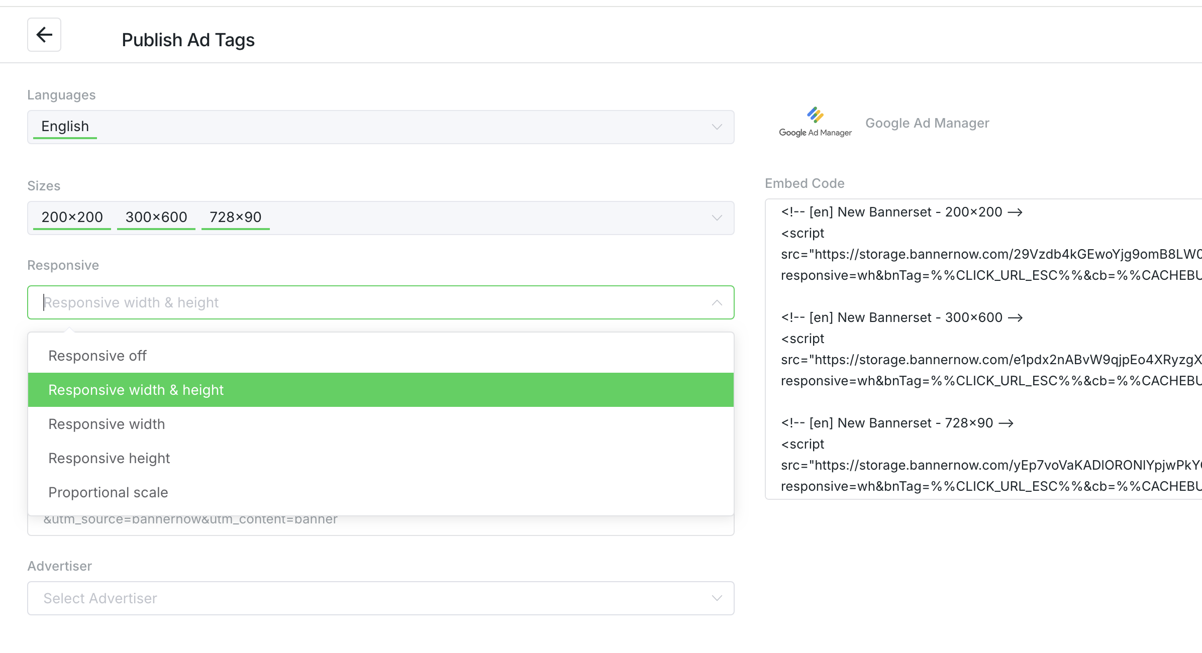
To publish the Responsive banner always select the Responsive Width & Height and place the AdTag/Embed code in a responsive div container on your page or use the responsive placeholder for the DSP/SSP:
