With BannerNow Analytics, you can track the performance of your ads with ease. View important metrics such as impressions, clicks, and click-through rates. You can also customize your analytics by selecting a specific date range to analyze. Our heatmap analytics provide valuable insights into user interaction, helping you optimize your creatives designs for maximum effectiveness. Also, you can compare the performance of multiple banners side by side, making it easy to identify top-performing designs and strategies.
To access the Analytics page, in the top menu click Analytics.
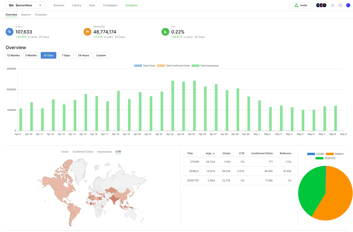
The first thing you’ll notice on this page is the summary of clicks, impressions, and CTR (click-through rate) information.
Below that, you’ll find a chart illustrating the performance of your ads within the selected date range. You can also view the analytics map, which indicates the countries where your ads have been viewed. This map provides valuable insights into the geographic reach of your campaigns.
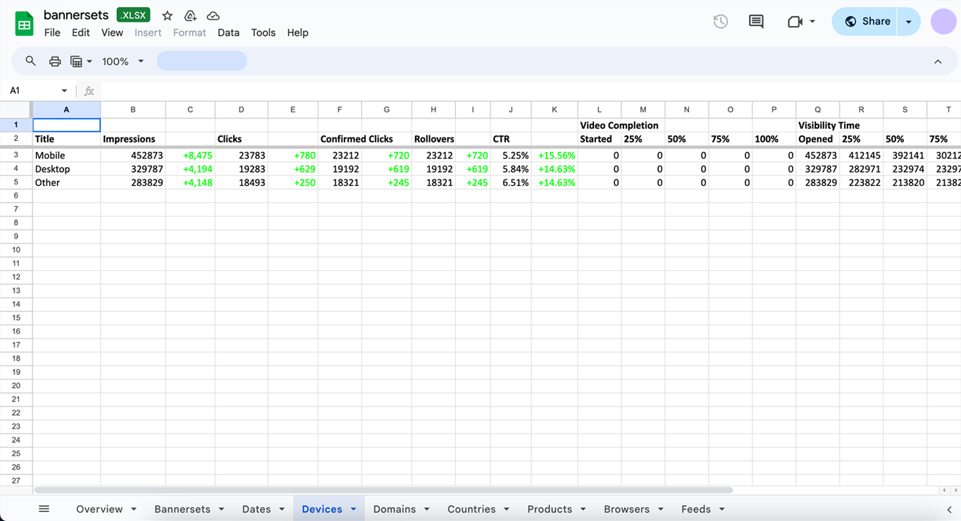
Next to the analytics map, you’ll find information about how your ads are performing across different devices, along with the corresponding CTR (click-through rate), impressions and rollovers.
Analytics pie chart is providing a clear breakdown of the devices where your ads have been viewed.
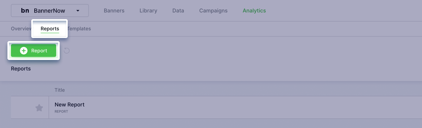
Let’s generate an analytics report, to access details regarding creatives, projects, decision trees, A/B tests, and every aspect of your campaign. Go to Reports tab and click New Report.
With our customizable report, you have the power to tailor your analytics to suit your specific needs. Choose from a variety of analytics options including heatmaps, feeds, and decision trees. Additionally, you can select specific ad sizes from your creative set to include in your report.
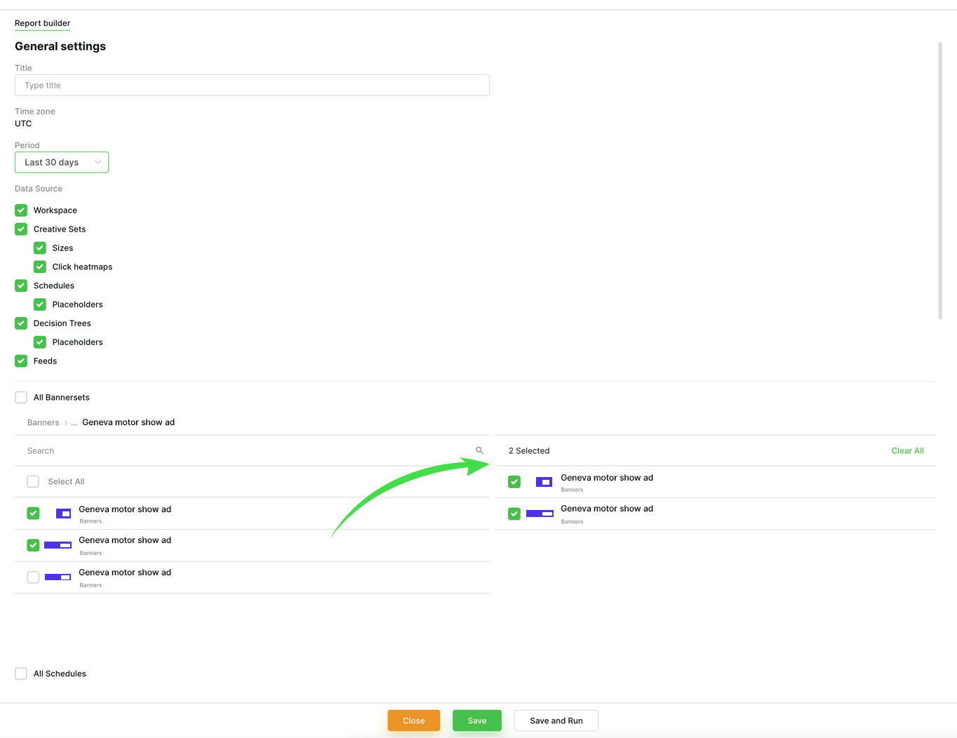
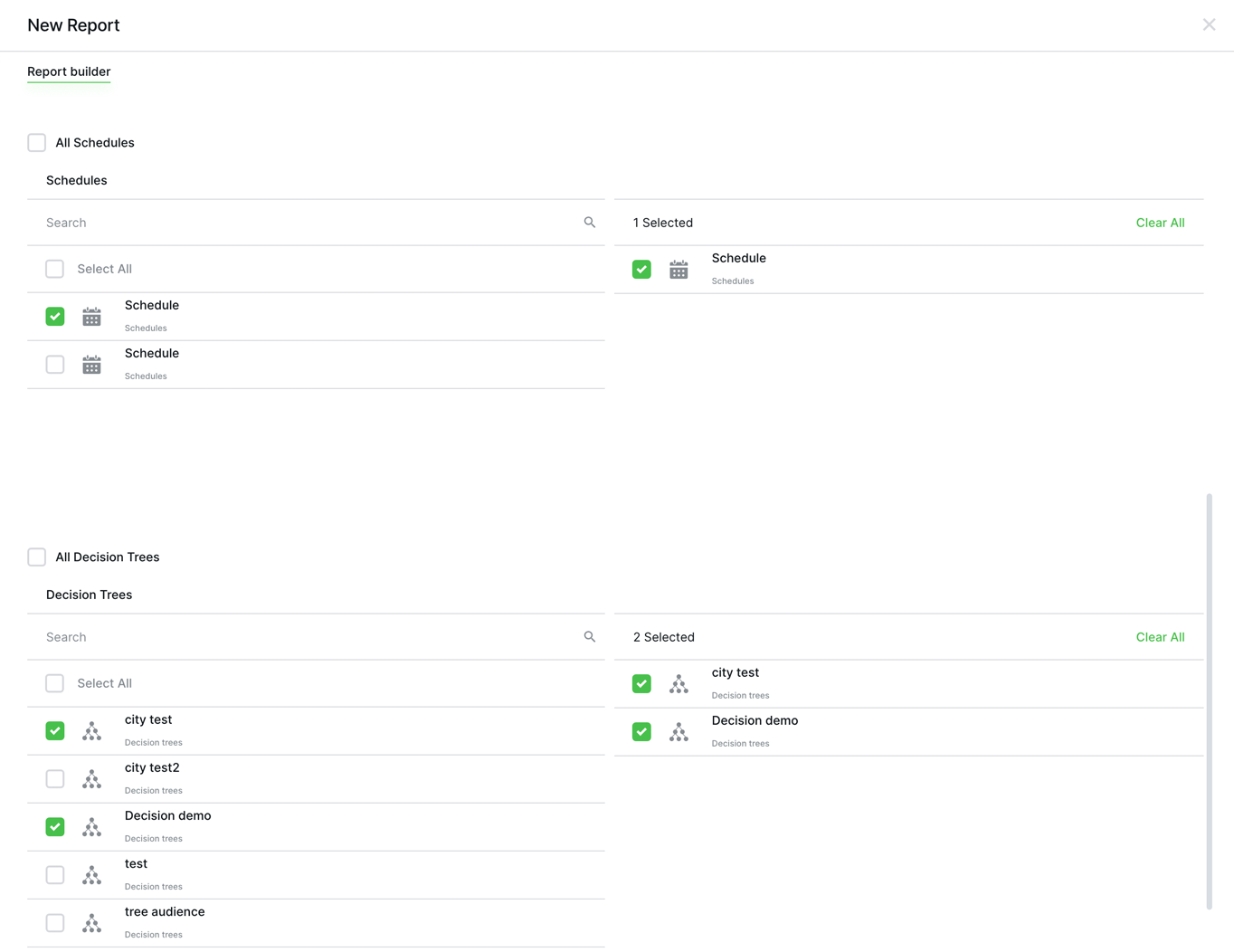
Select specific schedules placeholder for your report, allowing you to track performance over specific time when the ads were displayed. Incorporate decision trees, to analyze the data-driven decisions.
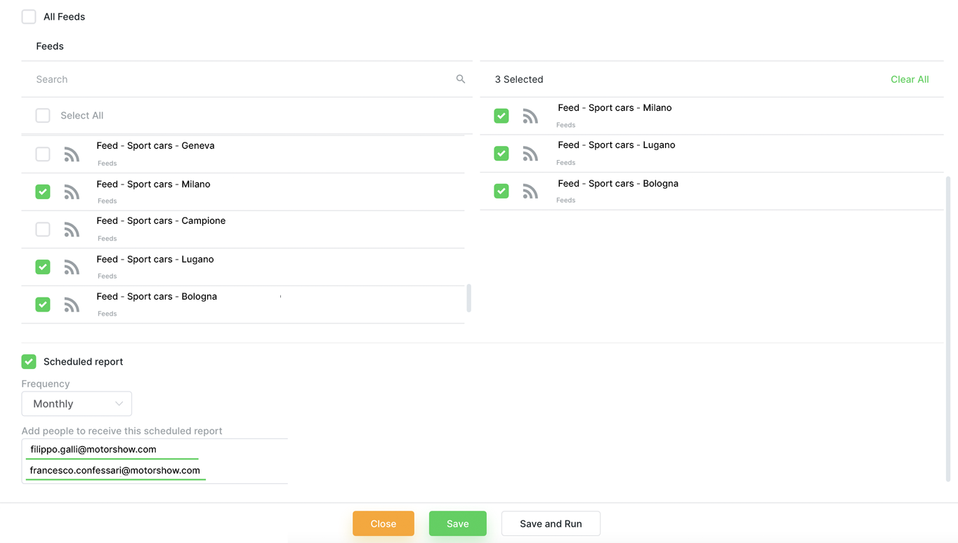
Gain valuable insights by adding feeds. For example, if you have a feed with products, the report allows you to analyze which ads featuring specific products from your feed received the most clicks.
Below, you’ll find an option to schedule your report. By setting the frequency to “monthly,” you’ll receive an email with your report on a monthly basis.
Once your customized report is created, you will receive it directly in your email inbox. The report is conveniently packaged into a downloadable zip file, providing you with detailed analytics.
Here’s what you’ll find in your report:
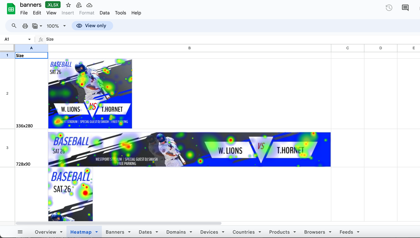
Heatmap, allowing you to identify which areas of your ad are capturing the most attention;
Ad Performance: Detailed analysis of each banner, including impressions, clicks, click-through rates, and conversions. Understand which banners are performing best and optimize accordingly;
Date Range Analysis: Track performance over specific date ranges to identify trends and patterns in your ad campaigns;
Browser Analysis: Insight into the browsers your audience is using to view your ads;
Impressions: Get a clear picture of how many times your ads have been displayed across different platforms and devices;
Product Performance: See which products are getting the most attention from your ads;
Geographic Data: Understand where your audience is located geographically;
Domain: Track performance across different domains;
A/B Testing: A/B tests created to compare the performance of different ad variations and determine which ones yield the best results;
Decision Trees: Utilize decision trees to understand the factors influencing ad performance and make data-driven decisions to optimize your campaigns.
and more…